Your cart is currently empty!
Blog

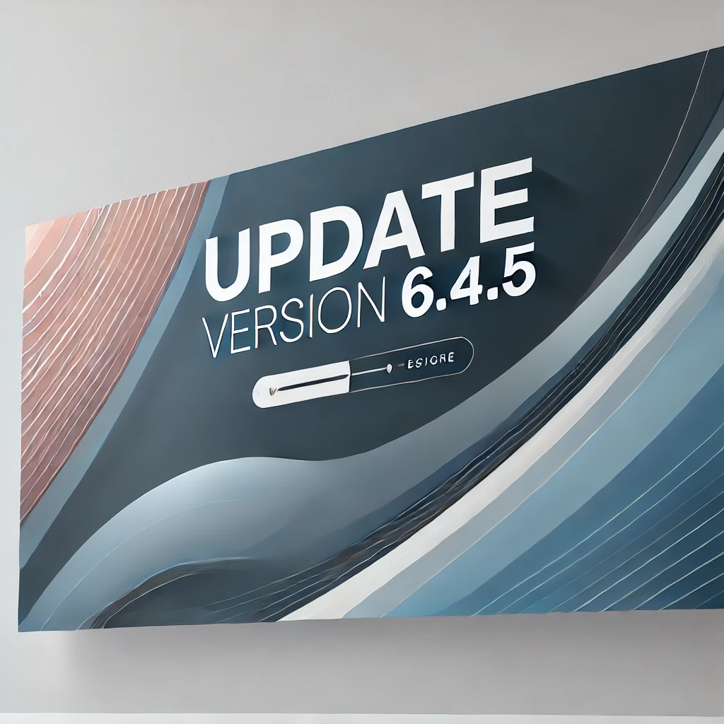
Exciting upcoming update for your WordPress theme: key changes and improvements
Posted inWeCodeArt FrameworkWe’re thrilled to announce a comprehensive update to our WordPress theme, packed with enhancements and new features to improve functionality […]